
Visualize your data by splitting them into several bins
![]()
![]()
![]()
![]()
![]()
![]()
![]()
![]()
![]()
![]()
![]()
![]()
![]()
Overview
- A dynamic Histogram
- Substitute your own data
- Change Histogram to alternate data
- Select array for delete
- Rebuid the array
- Adjust ranges
- Extrangeous Range Names
- Create a Histogram in Microsoft Excel 2016
- Category Frequency Distribution in Microsoft Excel 2013
- Create a Histogram in Microsoft Excel 2013
- References
A histogram is a bar graph (visualization) that shows the occurrence of values in each of several bin ranges.
Histograms provide a visualization of numerical data.
Frequency distributions visualize categorical (text) data.
Later on this page are steps to create a Histogram manually in macOS and Windows Excel 2016 and prior versions.
Throughout this page are “PROTIP” flags that highlight advice from experience not available elsewhere.
A dynamic Histogram
My favorite approach is to change a pre-defined spreadsheet which includes coding to provide a dynamic slider to control how many bins are shown:

-
Click to download the Histogram-Dynamic.xls Excel file at:
https://res.cloudinary.com/dcajqrroq/raw/upload/v1589759018/Histogram-Dynamic_re4yrn.xlsx
It contains a pre-made histogram which you don’t have to construct from scratch. The Excel sheet is from/described here, based on Jon Peltier’s techniques:
-
Click Save, OK, then open the file.
Colored cells are where values and formulas are changed for alternate data.
(This spreasheet contains only functions and no VBA macro code which trigger scary messages when loaded.)
-
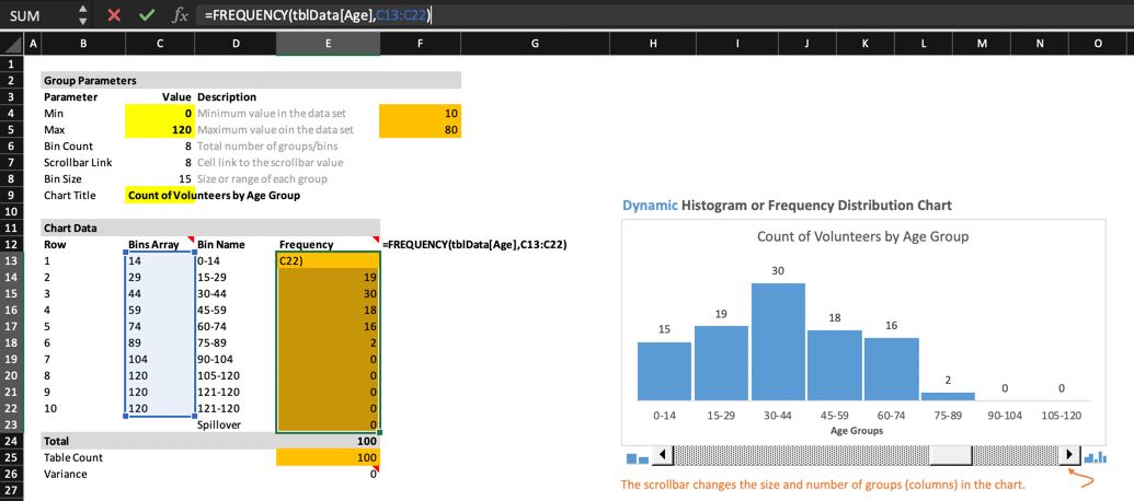
Drag the slider all the way right to see the most number of columns (10 columns), which is a good segmeentation for our base-10 numbering system.
Data in the sample spreadsheet are ages in a human population, which has a known range of values. Cells C4 and C5 (0 and 120) display those minimum and maximum values of bars in the Histogram. BTW, this is why someone around 60 years old is called “Middle Aged”.
-
Drag the slider all the way left to see the least number of columns (just 2 columns), which basically divides the population by half according to the range between 0 and 120, which is 60.
Notice that when the slider is moved, the Bin Count and Bin Size (B5 and B6) changes, as well as data with the “Chart Data” box. As the Bin Count changes, different rows are used in the Chart Data box.
-
Click on cell F5. Notice it displays the maximum values within the data range named. Cell F4 displays the minimum values in the same range.
The “BinsArray” column contains the upper limit for each step in the Histogram.
To display a Histogram of your own data, you would need to change the range name specified in those formulas and focumulas in the Frequency table.
Substitute your own data
The spreadsheet comes with an alternate set of data, modified from the Histogram-Dynamic.xls Excel file. To use it, click here to skip instructions below to insert your own data:
- In File, open your Excel file.
- Click the column heading of the entire column you want to copy.
-
Press command+C to copy the data highlighted to your invisible Clipboard.
-
Press command+~ to switch to the sample spreadsheet.
- Click the “Data” tab at the bottom.
-
Click on cell heading “D”.
We want to end up selecting a section of data spanning two columns (C and D).
-
Press command+V to Paste from Clipboard. Wait until the spinner icon goes away.
The first row contains column names.
- Click on cell D2 (under the heading) and press shift+command with down arrow to select all the data in that column. If there are blanks in the data, you would need to continue pressing to select the next group. Continue holding down shift+command with left arrow to select the (empty) C column as well.
- Manually write down somewhere the row number of the last cell.
-
Press command+C to copy into Clipboard.
-
Click on the Range Name in the Excel bar, and (if it doesn’t already exist) change it to
Repo_mb
-
Press Tab key to set it.
- Right-click within the selected cells to select “Define Name…” for a pop-up dialog.
-
Click the “+” icon at the lower-left corner to create a name Excel obtained from the first row.

-
Double-click on the name and press command+C to copy the name to your Clipboard:
Repo_Size_mb
-
Click OK to dismiss the dialog.
-
Press command+shift+S to save the file, changing the file name. Click Save.
Change Histogram to alternate data
- Click the “Histogram” tab at the bottom.
- Click on cell F4. In the formula, double-click “tblData” and press command+V to paste in its place the “Repo_mb” Range Name.
-
Click on cell F5. In the formula, double-click “tblData” and press command+V to paste in its place the “Repo_mb” Range Name.

-
Click on cell C5 to change the maximum value included in the Histogram. PROTIP: Make the maximum value in the Histogram larger than the largest value in the population which is also easily divisible. For example, the maximum population value of 40,034 would have a Histogram max. value like 50,000.
- Click on cell C9 to change the Chart Title.
-
Triple-click the text to select it all to type over your text.
Select array for delete
-
Click on cell E13 the first cell immediately under the Frequency heading. Notice its current formula:
{=FREQUENCY(tblData[Age],C13:C22)}
“tblData” is the Range Name.
“[Age]” is the Column Name.
“C13:C22” is the Bin Array.”{ }” designates an array saved by pressing shift+control+return.
On MacOS, to enable the key to actually control functions in Excel, go to System preferences > Mission Control, and disable shortcuts for Mission control.
-
On macOS, press control+U to reveal the bin_array (“C13:C22”).
PROTIP: Among Microsoft’s Rules is that if you try to change or delete cells in an array formula, you’ll see a “You cannot change part of an array” error.
-
To delete the entire formula: click a cell within the array. In the Home tab, if there is “Editing”, click that. Click the icon to the right of “Find & Select”, “Go To Special”.

-
Select “Current Array”, then OK. Now you can press
Delete</strong> on the keyboard. Rebuid the array
- Click the top cell of the Frequency array (E13).
-
Hold the shift key and click the last cell of the Frequency array, which is one more row than the bins for the spillover row.
NOTE: The spillover row’s value is not displayed in the Histogram (which is the reason why it exists).
- Click on the formula bar (to the right of the “fx” icon).
-
Copy the formula below and paste it in the formula bar:
=FREQUENCY(Repo_Size_mb,C13:C22)
You know you have it right when the bins array is highlighted in blue:
-
Press shift+command+return to save the array.
-
Change “Age Group” to the X-axis name, such as “MB in repo”.
Adjust ranges
PROTIP: The special feature of the sample spreadsheet is that if there are a few extremely large numbers (outliers) at the leftmost or rightmost column that would distort the analysis about the remainder of the population, exclude them by changing the value in cells C4 and C5, which define the minimum and maximum values of data presented in the Histogram.
-
If you prefer to remove extremely large (outlier) values permanently, right-click on F5 to select Copy of the value. Switch to the “Data” sheet and command+F to find that value. Right-click on the value to select “Delete…”. Select
Extrangeous Range Names
- Type in a new name in the box under heading “Enter a name for the data range:”.
-
Click OK to dismiss the dialog, which creates the name range.
For rngCount, the range of cells contains:
=OFFSET(‘C:/Users/Jon/Dropbox/Excel Campus/Posts/Dynamic Histogram/[Copy of Dynamic Histogram.xlsx]Histogram’!$K$13,1,0,’C:/Users/Jon/Dropbox/Excel Campus/Posts/Dynamic Histogram/[Copy of Dynamic Histogram.xlsx]Histogram’!$G$5,1)
For rngGroups, the range of cells contains:
=OFFSET(‘C:/Users/Jon/Dropbox/Excel Campus/Posts/Dynamic Histogram/[Copy of Dynamic Histogram.xlsx]Histogram’!$J$13,1,0,’C:/Users/Jon/Dropbox/Excel Campus/Posts/Dynamic Histogram/[Copy of Dynamic Histogram.xlsx]Histogram’!$G$5,1)
For more about dynamic named ranges using both the OFFSET and INDEX functions, see Mynda Treacy’s article.
Different versions of Excel have different procedures. Previous versions of Excel had a “Data Analysis Tookpak” which must be enabled in order for the FREQUENCY and other functions to be available.
Create a Histogram in Microsoft Excel 2016
Unlike previous versions, Excel 2016 has a easier way to create histograms with its “histogram maker” as a built-in chart.
-
To begin, have the data you want to use in your histogram into a worksheet.
If you opened a .csv file, save the file As a “Excel Worksheet (.xlsx)”.
- Click to highlight the entire dataset.
-
Click the Insert tab.
-
Click the Histogram icon or select Recommended Charts and scroll down to select the Histogram chart.

- Mouse over a number in the vertical axis until “Vertical Axis” appears, then right-click to select “Format Axis…” to open the Format Axis pane.
- Select Categories to display text categories.
- Select Bin Width to customize the size of each bin.
- Select Number of Bins to define a specific number of bins displayed.
- Choose Overflow Bin or Underflow Bin to group above or below a specific number.
-
Close the Format Axis pane when you are done customizing the histogram.*

- Save the file.
Category Frequency Distribution in Microsoft Excel 2013
This video is part of a series on statistics using Excel. Begin from 1:38
Get a unique list of values
In the Raw Data sheet:
- Press Ctrl+Home to get to the upper left of the Raw Data sheet.
- Click the heading to the column you want to analyze.
-
Press Ctrl+Shift+down to highlight all the cells of the column.
-
PROTIP: Specify a range name (such as “Priority”, etc.) so you can refer to the same range in several functions.
- Click Data ribbon, Advanced, Copy to another location, Unique records only, Copy to icon.
- Scroll right beyond the last column in the sheet and click a cell there.
-
Click the Copy icon again, then OK.

- Scroll back to the right where you specified.
-
You may need to clean up values in entries.
-
A trailing space counts as a separate value.
-
Make sure there are no blanks in the data.
-
- Press Ctrl+H to do a Replace All on the errant values to fix them.
- Delete the generated cells and
-
Repeat the above until there are no duplicates.
-
Sort or manually rearrange the order of items (if you have categories that don’t sort, such as “Very High”, “High”, “Medium”, “Low”).
Make the Frequency Distribution
-
Create Frequency, and Interval columns to the right of the unique list created.
- In the first data cell under the Frequency heading, type a formula =COUNTIFS()
- Click the first data cell of the category data being analyzed.
- Press Ctrl+Shift+down to select all rows.
- Scroll back to the distribution being built.
- Press command to specify another parameter.
- Click on the first cell of the unique items (the Criteria).
- Press ) to close the formula.
- Press Ctrl+Enter to save the formula.
-
Double-click on the lower-right corner to populate the rest
Calculate total and percentages
- Add a total in a blank row under data rows in the Frequency column.
- Format the total cells with borders top and bottom.
-
Click the cell holding the total and press Alt+=.
-
PROTIP: Verify that the total matches the number of rows in the data being analyzed.
- Create a percentage formula. Put a $ in front of the row number.
- Double-click on the lower-right corner of the first formula to populate the rest of the rows.
-
Highlight the Percentage cells and format it as Percents.
Bar Chart
- Highlight the category data and percent, including the headings.
- Click Insert tab, Stacked bar.
- Right-click the categories to select Format Axis.
- Check Categories in reverse order and close the pane.
-
Click on the title and change it to “Priority distribution” or whatever.
Add totals
-
A total at the bottom of counts makes it easier to verify whether you
Another Category Distribution
- Repeat the above for another distribution, if desired.
Create a Histogram in Microsoft Excel 2013
-
https://www.youtube.com/watch?v=Giewd9yH4q0
-
https://www.youtube.com/watch?v=YfVu7xGHgnA
-
https://www.youtube.com/watch?v=SDUgEuFrJ3o
-
Drag the lower-right corner to populate the other rows under Bin.
- Leave the last row empty so Excel uses it for anything larger than the last number.
-
Click in the first data cell under Frequency heading, and drag the lower-right corner to populate the other rows until the last Interval row.
-
Press Ctrl+Shift+Enter to auto-populate (as an array).
-
In the first data cell under the Frequency heading, type =frequency(.
-
Click the first data cell under the value column (C) as the first parameter.
-
Press comma.
-
Click the first data cell under the Bin heading (K), then click on the last cell in the column.
- To allow for easier…
-
Press Ctrl+Shift+Enter.
Adjust default gaps
-
Double-click on one of the columns in the generated chart for the Series Options UI.
-
Drag Gap Width to zero.
References
- https://www.youtube.com/watch?v=53DOu_vstvI
- https://www.youtube.com/watch?v=IVhQTAF1guc
-
https://www.exceltip.com/tips/histograms-in-excel.html
-
http://www.agentjim.com/MVP/Excel/2016HistogramMac.html
- https://www.exceltip.com/advanced-data-visualization-in-excel/4-creative-target-vs-achievement-charts-in-excel.html
https://www.youtube.com/watch?v=UASCe-3Y1to How To… Plot a Normal Frequency Distribution Histogram in Excel 2010 by Eugene O’Loughlin