

Statistics to evaluate classification: Confusion Matrix, Specificity, ROC, and AUC, etc.
![]()
![]()
![]()
![]()
![]()
![]()
![]()
![]()
![]()
![]()
![]()
![]()
![]()
Overview
NOTE: Content here are my personal opinions, and not intended to represent any employer (past or present). “PROTIP:” here highlight information I haven’t seen elsewhere on the internet because it is hard-won, little-know but significant facts based on my personal research and experience.
Sample
This graphic is from a sample Microsoft Azure ML Pipeline Visualize Evaluation result:
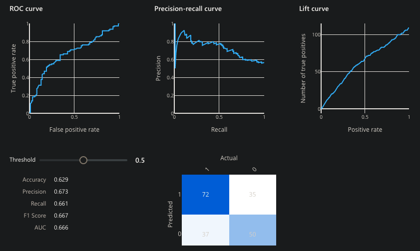
Azure does not present all the statistics which we cover here.
Evaluation
Among the statistical measures presented:
Confusion Matrix
The multi-colored box at the lower-right is called a “Confusion Matrix”, a metric of classification model performance.
DOC: Test data was split so some of the data is used to determine how well predictions created from a model. The matrix is presented in a 2x2 box with the Predicted label to Actual (True) Label (yes or no) to identify true/false positives/negatives.
REMEMBER for the test: Draw this on the white board from memory:
| n=165 | Actual: YES 105 | Actual: NO 60 |
|---|---|---|
| Predicted: YES 110 "Precision" Relevant: | 100 True Positives "Sensitivity rate" | 10 False Positives (Type I error) "False alarms" |
| Predicted: NO 55 | 5 False Negatives (Type II error) "missed it!" | 50 True Negatives "Specificity = Recall" |
| All: | Accuracy rate | Error rate |
Outside the box of n (total): VIDEO:
-
Accuracy Overall, how often is the classifier correct? (TP + FN) / n = ( 100 + 5 ) / 165. This can be misleading because it include both true positives and true negatives.
-
Prevalence: (aka “Error Rate”) How often does the yes condition actually occur in our sample? actual yes/total = 105/165 = 0.64
Based on n (total) diagonal:*
-
Average Precision (AP) is the ratio of correct predictions (True Positives + True Negatives) to the total number of predictions. When it predicts yes, how often is it True (correct)?”. (100 + 50) / 165
-
Misclassification Rate : Overall, how often is it False (wrong)? (10+5) / 165 = 0.09
Within the box:
- Precision rate is the ability of a classification model to identify only the relevant data points. It is the percentage of items selected (True Positive and False Positive) which were relevant = correctly predicted yes: 100 / 110 = 0.91. This is used in studying rare diseases when many more people would not have the disease than with the disease or picking terrorists.
VIDEO: Columns represent the known truth: The higher the number, the better:
-
Sensitivity (aka “Recall”) rate or the ability of a model to find all the relevant cases within a dataset. Sensitivity is the percent of items correctly identified as Positive from among relevant items selected. (True Positives and False Negatives). It is the percent of = TP / (TP + FN) = 100 / (100 + 5) = 0.83.
-
Specificity rate is the percent of no’s correctly identified as Negative = TN / (TN + FP) = 50 / (50 + 10) = 0.83.
A perfect classifier has precision and recall both equal to 1. But Positivity and Recall metrics cannot both be perfect. conflict with one another.* Precision and recall should always be reported together.
Different values in the Confusion Matrix would be created for each level of threshold.
F1 Score
VIDEO: F-1 Score is a single number that takes into account both precision and recall: the weighted average (harmonic mean) of the true positive rate (recall) and precision = 2 ( 1/P + 1/R ). When comparing between models, the larger the F1, the better.
F1 is also called “F beta” where a beta adds other than 0.5 weight to either precision over recall.
Some plot the F1 Score over time in a line graph to determine progress over time.
ROC and AUC curves
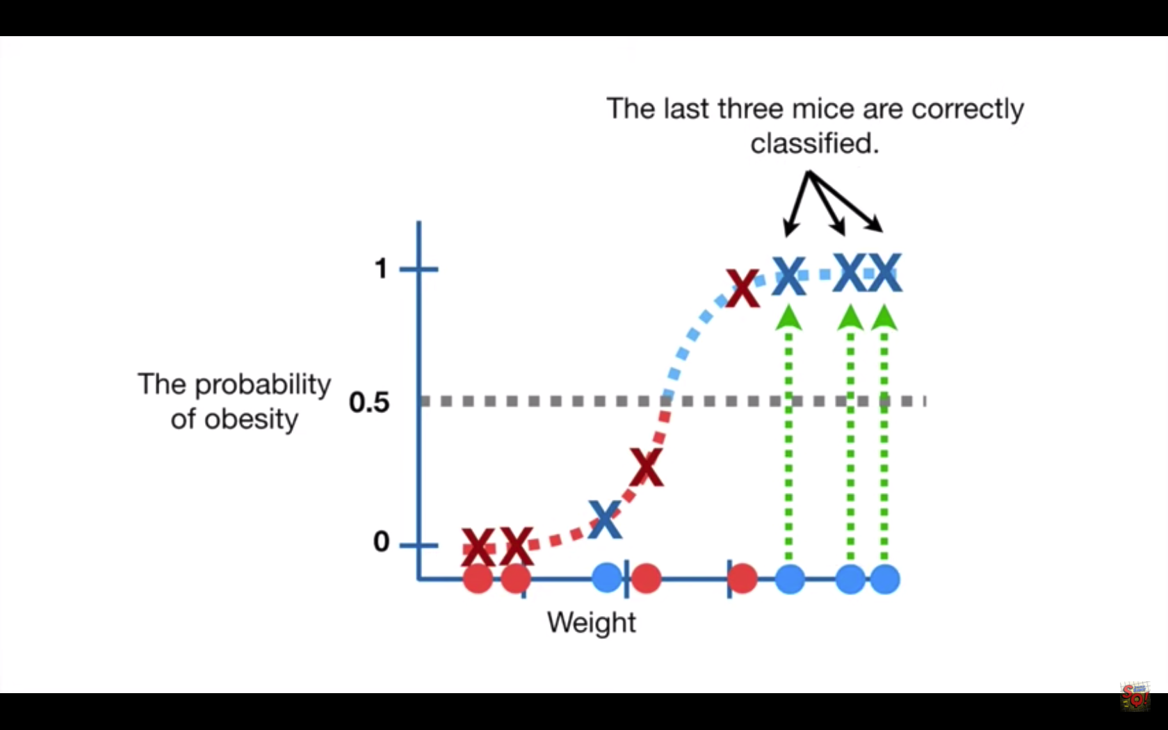
For a model that predicts the probability of obesity in mice based on weight, each combination of probability and weight is plotted twice: Along the horizontal line, a red dot is placed for each subject we know to be “not obese”. The heavier the subject’s weight, the further that subject is placed to the right of the line. A blue dot is placed for each subject known to be “obese”. Additionally, as an X (like a scattergraph) for the combination of weight and probabilty predicted. Blue designates correct and red designates each incorrect prediction.
The Threshold, shown at “0.5” can be adjusted up or down (even though the control is horizontal).
The Threshold would be set lower when it is important to correctly classify positives (such as whether a patient is infected).
But this would likely increase the number of False positives.
ROC (Receiver Operating Characteristic) curve shows the relationship between the rate (percentage of) True Positives aka “Sensitivity” on the Y axis vs. the percentage (rate) of True Negatives on the X axis, as the decision Threshold changes.
In other words, the ROC graph summarizes all the Confusion Matrices resulting from each Threshold setting, so you can select the level appropriate.
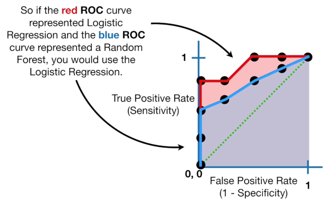
AUC to compare ROC curves
The VIDEO: AUC (Area Under the Curve) diagram compares different ROC curves. For example, to compare methods of categorization (such as between Logistic Regression vs Random Forest).
A model with AUC of 0.5 performs no better than random chance. The larger the AUC to 1.0 the better the model is at separating classes. Thus, the ideal AUC is 1.0.
References:
- https://towardsdatascience.com/the-roc-curve-unveiled-81296e1577b
Outlier Z-Scores
Outlier detection refers to identifying data points which deviate from a general data distribution.
A Z-score is a statistical measure of variation from a mean.
Such existing unsupervised approaches often suffer from high computational cost, complex hyperparameter tuning, and limited interpretability, especially when working with large, high-dimensional datasets.
ECOD
More complex calculations include Unsupervised Outlier Detection with ECOD (Empirical Cumulative Distribution Functions). ECOD a simple yet effective algorithm to focus on outliers as “rare events” that appear in the tails of a distribution.
ECOD works by first estimating the underlying distribution of the input data in a nonparametric fashion – by computing the empirical cumulative distribution per dimension of the data. ECOD then uses these empirical distributions to estimate tail probabilities per dimension for each data point.
Finally, ECOD computes an outlier score for each data point by aggregating estimated tail probabilities across dimensions.
This IEEE document published 16 March 2022 proposed ECOD as parameter-free and easy to interpret. The paper showed that ECOD outperformed 11 of 30 benchmark datasets in terms of accuracy, efficiency, and scalability. A easy-to-use and scalable Python implementation is released with the report, for accessibility and reproducibility.
References:
- https://www.linkedin.com/pulse/handbook-anomaly-detection-python-outlier-3-ecod-kuo-ph-d-cpcu/
- https://ieeexplore.ieee.org/document/9737003
Isolation Forests (iForest)
Isolation forests are a variation of random forests that can be used in an unsupervised setting for anomaly detection.
Isolation Forest detects anomalies using binary trees. The algorithm has a linear time complexity and a low memory requirement, with linear time complexity. So it works well with high-volumes of data.
The algorithm was initially developed by Fei Tony Liu and Zhi-Hua Zhou in 2008.
References:
- https://www.wikiwand.com/en/Isolation_forest
- https://machinelearninginterview.com/topics/machine-learning/explain-isolation-forests-for-anomaly-detection/