

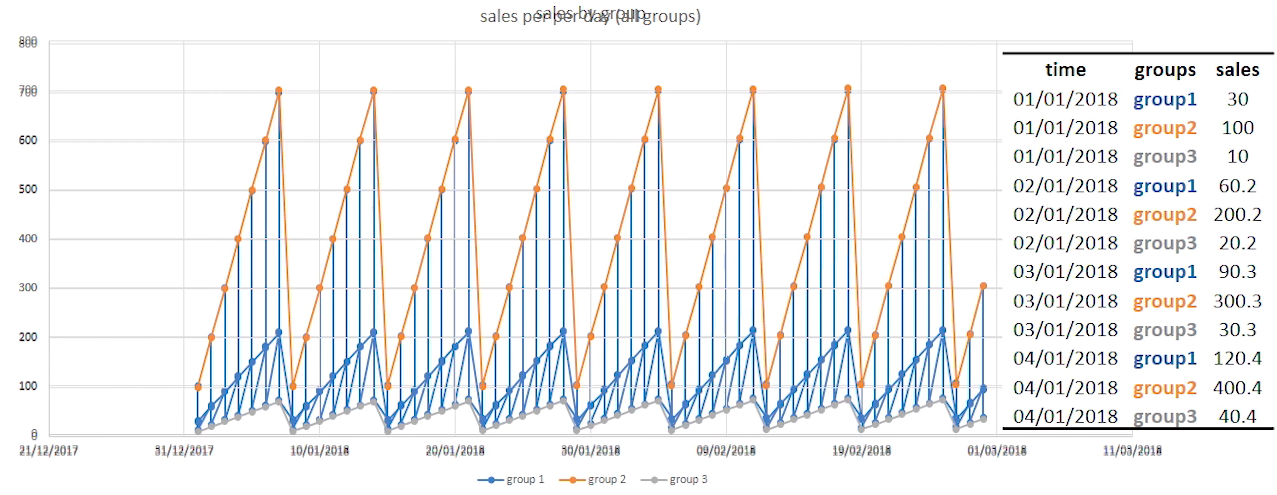
See all 4+ dimensions (time) in visualizations
![]()
![]()
![]()
![]()
![]()
![]()
![]()
![]()
![]()
![]()
![]()
![]()
![]()
Overview
Understanding the trend of numbers over time is a fundamental skill. That’s why it’s taught in elementary school. Why?
“Those who don’t know history are doomed to repeat it.” – Edmund Burke
Excellence defined
Below are vizualizations that have the following traits:
-
Dynamic data - update visualizations (in “live mode”) as data changes in sources such as databases.
-
Visual querying - change the query by selecting or clicking on a portion of the graph or chart (to drill down, for example).
-
Linked multi-dimensional visualization - selections made in one chart are reflected as you navigate into other charts.
-
Animation -
PROTIP: Dynamic (movie mode) is available only within the Tableau Public client, not when viewed on websites (as of 2016-01-05).
-
Personalization - give power users an in-depth view and newbies a simpler view, and also control access to data based on user- and role-based access privileges.
-
Actionable alerts - thresholds and parameters that trigger messages whether you’re interacting with reports or not.
Fortune 500 in the US

The higher each line appears, the higher the company is on Fortune magazine’s 500 largest public companies.
Companies that have a rising trajectory include:
- Whole Foods Market
- Amazon
- Alphabet (Google)
- Apple
- CVS Health
- Comcast
- Dollar General
- Gilead Sciences
- Qualcomm
- Visa
- Master Card
- Cognizant
- Oracle
Plus, globally:
- Softbank
Examining the HTML shows use of the Chartbeat JavaScript library for visualization.
Nicolas Rapp also created for Fortune 500 this graphic:

Hans Roling
Since 2007 at http://www.gapminder.org/videos/ Hans Roling, a professor of health statistics in Sweden, is an internet legend for his “Joy of Stats” video shown on BBC Nov 10, 2010 and Ted Talks. In them he shows his Gapminder web app which presents multiple dimensions dynamically over time (nearly 300).
Jeffrey Shaffer (@HighVizAbility, co-author of bigbookofdashboards.com) created a time lapse video of his viz showing a trail of dots which grow in size and get darker over time (as the legend notes):

Here, different colors represent different countries, with the United States in red. Most other countries saw a decrease in fertility rate over time while life expectantcy increased.
Within the wonderful Tableau gallery Andy Cotgreave (@acotgreave, now Technical Evangelist at Tableau) built over the years is this re-creation of Gapminder:

Andy explained in 2010 how he created the above using Tableau Trendalyzer v6. Download his viz from the Tableau Public website to manipulate using Tableau Public client installed on your laptop.
The trails is a recreation of (@moritz_stefaner) “Remixing Rosling” in @tableau.
Cycle Time

Metrics include:
- Percent of value-add time vs. total time. For example: In the case of physician visits, time interacting with physician vs. waiting and other activities.
H20.ai
h20.ai
provides a web-based (SaaS and on-premise) tool that automatically visualizes a time series dataset:
VIDEO:
H2o’s software is called “driverless” because it automatically recognizes multiple groups (annual, monthly, weekly, daily, hourly, etc.) by analyzing calculated lags, standard deviations, and other descriptive statistics. It also looks at interactions between trends.
Visit the h2o Aquarium: “Introduction to Driverless AI” Lab
https://www.h2o.ai/try-driverless-ai/
Time Series databases
-
KDB proprietary runs in-memory within a single machine.
-
Graphite - legacy invented by Expedia - does automatic roll-ups of data (losing irregular values)
-
RiakTS from Basho is built for scale
-
Promethius for DevOps (highly available with scaleout?)
-
Cortex is a time-series built on Prometheus to be horizontally scalable, highly available, multi-tenant, long-term storage.
-
OpenTSDB is a layer on top of HBase.
-
TimescaleDB, an open source time-series database engineered from PostgreSQL,
-
InfluxDB - my notes, open-source (MIT)
- No external dependencies (written in Go)
- SQL-like query language
- Input data “Line Format” (not JSON)
- Stores data in compressed format
- Horizontally scaleable (across several servers)
- Kapacitor collects anomalies
-
Microsoft Azure introduced in 2017 their Time Series Insights.
You need to add your account to it so you can view the Time Series portal at https://insights.timeseries.azure.com for an Environment you define.
InfluxDB Performance Tuning & Schema Design - June 2016 by Gunnar Aasen
- Amazon Timestream
More on front-end styling
This is one of several topics:
- UI Design Systems
- Text Editors
- Markdown text for GitHub from HTML
- gRPC (g___ Remote Procedure Call)
- Front-end UI creation options
- Docusaurus static website generator
- Static websites
- JAM Stack Website Project Plan
- Jekyll Site Development
- Website styles
- Website Styling
-
Protractor to automate testing of Angular and other web pages
- Email from website
- Search within Hyde format Jekyll websites
- Data Visualization using Tableau